Wednesday 30 April 2014

Cyanotypes and Vandyke Brown Print

Cyanotypes were in invented in 1842 by Sir John Herschel for copying documents and later introduced into the world of photography by Anna Atkins who, is referred to as the first female photographer. 'Atkins' created photograms by placing plant life directly onto coated paper allowing the action of light to create a silhouette effect. These prints were made into a limited series of cyanotype books, documenting ferns and other plant life. The name refers to the distinctive cyan blue cast purposely created that resembles blueprints.


Chemicals are brushed onto water colour paper or another medium of choice, which, will react when exposed to UV light. The brush strokes can be incorporated into the finish of the print to add texture.

The chemicals used are:
  • Potassium ferricyanide and Ferric ammonium citrate (green) are mixed with water separately.
  • The two solutions are then blended together in equal parts.
To create Vandyke brown prints the chemicals used are:
  • Dissolve 10 grams ferric ammonium citrate in 30 ml distilled water.
  • Solution 2: Dissolve 1.5 grams tartaric acid in 30 ml distilled water.
  • Solution 3: Dissolve 4 grams silver nitrate in 30 ml distilled water.
  • Combine the 3 solutions and stir well. Add enough distilled water to make 100 ml of solution. The solution will keep for several weeks if stored in a cool, dark place.
A photogram is one way to create a cyanotype or Vandyke brown and another is to use negatives as a contact. A negative can be created from digital photography which, is known as 'hybrid photography'. Following a tutorial in class, I have produced a negative from one of my digital files.


The original colour image


A negative created from the original file in Photoshop


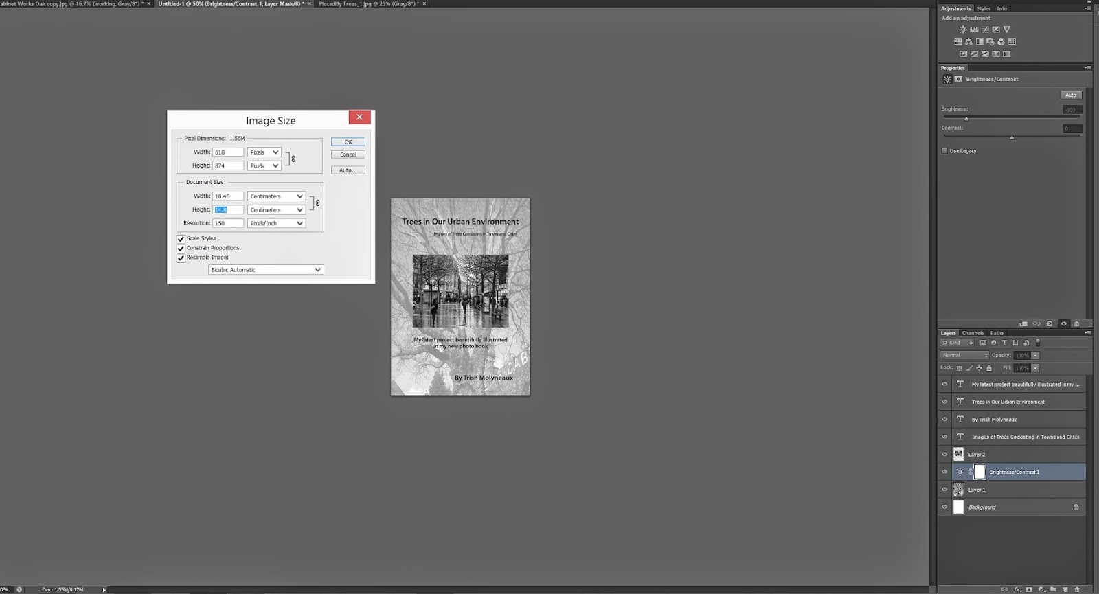
The negative from a digital file is created as follows:

  • Open the chosen jpeg in Photoshop
  • Create background copy 
  • Gradient map layer used to turn the image black and white
  • Add a levels layer to adjust contrast (black and white)


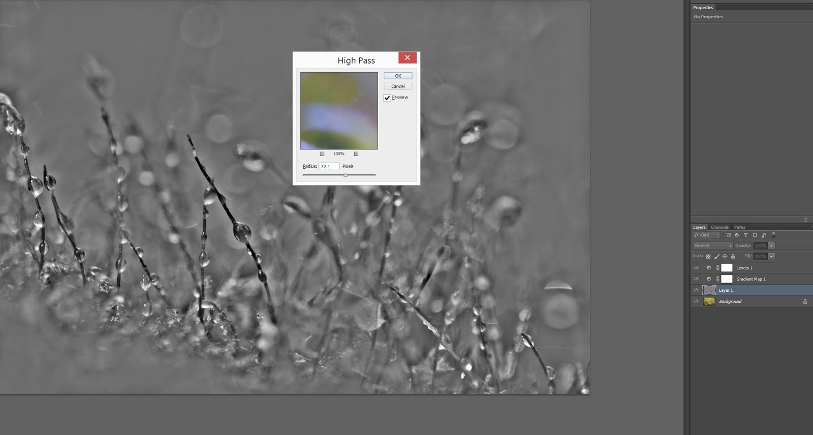
  • On the menu bar, select Filter/Other/High Pass then adjust the slider to the desired effect
  • Select the blending mode as Overlay


  • Create a new layer then enter values in the colour picker menu that will be typical cyanotopes shade
  • 47 R, 161 G, 219 B
  • Use paint bucket to fill the entire image
  • Select the blending mode as Overlay


  • On the menu bar, select Image/Adjustments/Invert
  • Create a new layer and enter new values in the colour picker to create an orange layer that will help enhance the cyanotype
  • 243 R, 110 G, 81 B
  • Fill with the paintbucket and select overlay again

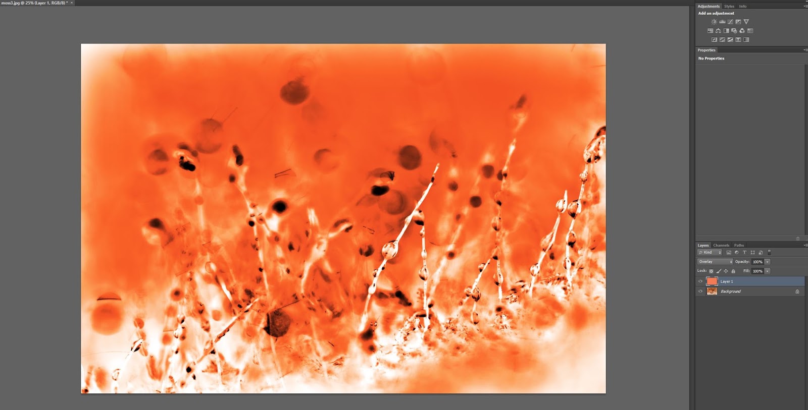
The negative can then be printed on transparency film ready to create a cyanotype. To produce a Van Dyke Brown negative, the added orange layer step is omitted.

“kdstevens” on Lomography (2012)


The scene in this image already implies age by the strong layer of dust and I feel is further enhanced by the Vandyke brown printing process. I really appreciate the tones created by this method.


Flowers work well for cyanotypes
The glass bottle was an interesting addition


Two cyanotype photograms created by placing objects onto the treated paper then 'cured' for approx 7.5 minutes with UV light.


The finished Vandyke brown print result
Negative produced to create a Vandyke brown print


A Vandyke brown print created from a digital negative.


Evaluation/Reflection
This was an extremely interesting and involving process to learn. I enjoyed evey step of the way including Photoshop, which, I have to admit, I am still not a master of. The paper sensitising was quite a 'messy' process but I feel this added to the feeling of creation and satisfaction at the end. Things did go wrong and I had to experiment with different UV exposure timings to get the right result. At one point my Vandyke brown print actually 'washed off' during the rinsing stage, meaning I needed to repeat the process and try again. The second time attempt was successful as can be seen in the scanned print I added to this blog and being honest, I was quite satisfied with.
My chosen subject seemed to suit the process and the visible tones were quite pleasing. Both printing methods add a feeling of old world to the prints, which, I wanted to portray following research on Cyanotypes by Atkins cited on Wikepedia (2014).


Bibliography

Encyclopaedia Britannica. (2014). Anna Atkins. Available: http://www.britannica.com/topic/1255795/contributors. Last accessed 6th May 2014.

MacGee, S. (2010). Cyanotype history – John Herschel’s invention. Available: http://www.alternativephotography.com/wp/history/cyanotype-history-john-herschels-invention. Last accessed 6th May 2014.

Stevens, K. D. (2012). Beat the blues: Making cyanotypes. Available: http://www.alternativephotography.com/wp/processes/cyanotype/beat-the-blues-making-cyanotypes. Last accessed 7th May 2014.

Stevens, K. D. (2012). Beyond the blues: Vandyke brown printing. Available: http://www.alternativephotography.com/wp/processes/kallitypes/beyond-the-blues-vandyke-brown-printing. Last accessed 7th May 2014.

Wikepedia. (2014). Anna Atkins. Available: http://en.wikipedia.org/wiki/Anna_Atkins. Last accessed 6th May 2014.


Wednesday 23 April 2014

Studium of Images

Henri Cartier-Bresson
Gestapo Informer, Dessau, Germany, 1945
  • The three main characters are the focus of attention adding drama and tension to the scene
  • Appears to be a person being accused of a crime
  • Depicts war-time which, is clearly indicated by the striped prison uniform
  • Expressions of all the three main focus subjects tell a distinct story (shame, pride, disinterest)
  • The onlookers appear intensely interested in the outcome of this encounter
Martin Parr, British Tabloid, Beach Scene (1991), Skegness, England
  • Ironic that the man depicted holding the newspaper featuring something about 'FATSO' is also overweight, part of a less than flattering British holiday scene
  • The stripey deckchair invokes memories of holidays past for me as it will for people of a similar age and older
  • Are we to believe all the people who frequent this holiday resort are overweight as there are lots present in the scene we see, even the child is chubby
  • Reading the Sun newspaper oblivious to the child's needs doesn't paint a good picture of parent hood
  • The mother is mostly omitted from the frame suggesting our attention and focus should be on the tabloid newspaper being read

Joel Meyerowitz, (1965) Florida
  • A scene which, shows us the wealth present in the area due to the boats, cars and hotels
  • Colour is used to advantage, showing us the rich tans and colourful fashion of the women we see
  • Long shadows tells us what time of day the image is shot making me question why the women are still dressed in sun attire
  • The man we see in the car gives me the impression he is either dropping the women off or waiting to collect them. Perhaps it is neither and he is merely watching them
  • The man just out of the frame who's arm we can see holds the interest of one of the women whilst the other woman looks in a different direction, perhpas suggesting a deal of some type


Photo Book Evaluation

">Urban Trees Photo Book link

Originally I published my photo book with an online zine website called ISSUU however, I wasn't satisfied with the result of this and still felt it was important to have a physical copy of my photo book in order for the images to be appreciated in full. Looking at images on a screen simply doesn't hold the same interest or feel like it has the same value as actual prints.
In keeping with my research into photo books, the printing of my project 'Urban Trees', has been ordered with Albelli. I found the software very user friendly for both inserting the images and adding text. My previous experience with photo books involved using a company named Photobox which, I didn't find user friendly and found myself constantly losing patience with the process. Albelli gave the option of assembling the book online or downloading their software which, provided more options. I chose the latter finding it a much safer way of saving changes and appreciated not being reliant on my internet connection which, gave me more confidence. There is also an option to view your book online and share that link with social media. I have shared this link with twitter and facebook but have yet to receive any responses.


Evaluation/Reflection
I have now received my photo book back from Albelli and I am pleased to say I am very satisfied with the quality and service from them. The gloss paper finish that I included has worked well to avoid the black and white images looking to flat and there is no bleed through of the black ink from page to page. With hindsight, however,  I would have chosen a different layout with more variety of image sizes and orientation to keep the visuals more interesting. My included text looks a little 'squashed' at the bottom of the page and this could have been avoided if I had varied the size of the images and placed the text alongside them. It is also a good experience to be able to hand my book to anybody interested my work rather than trying to show digital images. I would use Albelli again and feel that my research into the various companies has been worthwhile.


Friday 4 April 2014

Photo Book Poster and Flyer

The following screen shot (Image 1) shows my promotional poster being resized to A4 (29.7 x 21cm) dimensions in Photoshop. This is achieved by selecting 'Image Size' from the top menu bar and inputting the correct figures in the width and height sections in this menu. The resolution has been set to 150 pixel/inch to maintain a good quality print whilst keeping the overall file size down.

Image 1
Image 2


The final image of my poster created in Photoshop by layering different images being used in my new photo book, resized and saved to fit A4.


My flyer is then created by resizing the poster to size A6 (10.5 x 14.8cm), using the same method as above for the A4 poster. (Image 3)

Image 3
Image 4


Image 4 illustrates the flyer finished and ready to print to size A6. Four images would be printed on size A4 paper.


Wednesday 2 April 2014

Intentional Signifiers and Signified language in my Images

The Task:
To produce at least three images depicting different messages by using different techniques, views or situations. An object, person or scene may used to accomplish this but there must be distinct signifiers and signified messages in each image.
For this task, I have used one of my fellow students as a model and photographed him in different poses and environments.


Image 1


The signifier in image 1 and 2 is a young man in what appears to me to be a compromised situation. The fallen tree trunk in image 1 strikes me as uncomfortable and I find myself not wanting him to venture out any further despite him being quite at home. Image 2 sees a serious facial expression and again I am concerned for safety reasons even though my model is more than confident in his venture. His hand near his face in image 1 implies thinking and that is actually true, had the surface not been so slippy, he would have carried on walking further out. I intended to show a young carefree person in my images and hope this is what I achieved rather than showing my unease with the situation.
Image 2


My judgement is no doubt coloured by my dislike of heights and perhaps because I am a mum and have natural protective instincts. A younger person viewing these images may well look at them and consider the activity 'fun' or perhaps wonder if he is protesting against something whilst perched on the tree trunk. I know that the descent from the container in image 2 happened quite safely but it does look like Rob is considering the distance to the ground and his crouched position further enforces this belief.


Image 3


In image 3 we see a very different view of the same person which, shows us him checking a photograph on the camera playback. His hand gripping the wire door may look as though he is unsteady, the truth is that his hand was the subject of his photography and he simply hadn't removed it.
Image 4


Image 4 has been taken at a slightly upwards angle to add a feeling of importance to the person in the image. We see here a student looking like he is interested in the computer screen. In reality, this is the log on screen and my model is just pretending to do some work at this point.


Conclusion
I found this exercise interesting and fun to carry out. I had to really think about the signified message I would be giving out in my images and whether it would be understood by viewers. Simply taking a photograph of any subject isn't that difficult but it takes a lot more skill and consideration to purposely deliver an understandable message. The messages we read into an image will always be clouded or influenced by our own experiences of life and social upbringing, something else to consider when trying to project a message through your photography. In my images above, the aim was to portray my fellow student in many different lights and hopefully influence the viewers opinion of him. I believe that I achieved my aim to a certain extent, however because of his clothes, he does retain a young and carefree look in all the images and to substantially change perception, a change of style would most likely be required.


Photo Book Images

The following images are my chosen and edited work that will be incorporated into my latest photo book.

My current photography project is about trees and their presence in the urban environment. I wish to show how trees manage to survive the environment we place them in, as well as how they manage to evolve against the odds in urban settings and how we co-exist with this magnificent and important life form. Sometimes surviving inhospitable environments and living on long after man made buildings crumble, trees are something we see every day and perhaps don't notice their presence or appreciate their valuable function. Sometimes we also use trees outside our homes, in towns and cities to our own advantage with little regard to the tree's welfare.

Image 1
Image 2
Both of these images depict very different trees set against man made buildings. Image 1 lets us see the crumbling building behind the ancient Oak that is probably the older of the two. Image 2 witnesses the tree being used for lights at Christmas time. This one is set against better kept buildings and there is also distinctive evidence of pruning.


Image 3


In image 3 we observe another crumbling building which, looks earmarked for demolition. I do hope the tree inside the boundary will not be removed along with it and will remain to stand proud just as the other tree we see to the right.
Image 4


Image 4 shows us another view of the grand Oak that stands in the grounds of a churchyard, next to the delapidated remains of  'Garnetts Cabinet Works'.  Hopefully the placement of this tree will protect it when demolition of the building finally takes place. The long time neglected building has plant life emerging from its decaying bricks.


Image 5


Quite often trees are planted in formation to suit our needs. These trees which, look like they have been planted to divide the playing fields have grown in a unified pattern whilst battling the winds of an open field.


Image 6

Just about every cemetary I have ever seen has some degree of trees both lining the paths and surrounding the headstones. I believe it adds a feeling of importance to an otherwise sombre place. There is also a message of something being alive in amongst the graves. Trees also have meanings such a peace, old age and eternity. History tells us Yew trees were even used instead of headstones to mark a grave by the poor. The bare trees in my image heightens the feeling of old age and history.


Image 7

Image 7 which is blatant advertising, reveals a Palm tree planted in an attempt to convey a specific message. The sunbed shop is perhaps trying to tell us this is a tropical place and make us think of having a lovely tan. It is a stark contrast to the trees we see on the right hand side of the image which are more fitting with the environment and have been there a long time. Incidentally, the Palm tree doesn't look very healthy.


Image 8


This tree caught my eye, not only because of bringing a little beauty into a drab looking shopping area but also the shape of the trunk reminded of stories I read as a child. A younger person viewing this image may very well not see the shapes that I do however, to me it does appear to have arms that carry the burden of the branches above.


Image 10
Image 9
Image 9 on the left depicts a growing popular trend in garden tree sculpting. Due to our way of living, owls are becoming a rare occurence in our gardens. It's placement in the natural greenery tries to imitate nature. Image 10 shows a Chestnut tree standing alone and completely out of place. I have centralised the tree, revealing the bland surrounding residential environment.


Image 11


Once again we see how trees have been deliberately planted symmetrically to suit our needs. Trees provide areas of shade and as we see here, the seats have been placed in between the trees and also provide places of solitude. There appears to be a barrier separating the areas to walk the path.


Image 12


Trees add character and inject some nature into our city centres as this image depicts, taken in the centre of Manchester. They help to bring birds into the area and provide an area of shade in the Summer. Once again the planting uniformity is evident even as we build in between and all around the trees. The lines of the trees follow the lines of the buildings.


Image 13


A fence has been erected around the base of this Thorn tree to protect it and also signify that it is important in some way. A little research reveals a Pagan history surrounding a tree planted here since the 12th century. This particular tree is reputed to be an offshoot of the holy Glastonbury Thorn. Decoration will take place at the end of June via red ribbons and garlands tied to the branches which, is know as 'bawming the thorn'.


Image 14


The fence in this image is an obstruction rather than protection for this tree. It protects us from the railway line and forces nature to survive around it or as it has developed in this instance - through it. This brings thoughts of how strong and resilient nature can be.


Image 15


A juxtaposition is depicted in this image as our use of the tree is bringing artificial light into a town whilst trying to encourage nature with the use of a bird box. I'm not convinced the artificial home and lights would be a bird's first choice of habitat.


Image 16

This is my final image and I feel it works due to it's imact and positioning of the tree stump within the frame. It does't really need explaining, however I do feel it has captured a sense of humour. Even though the tree has been cut down, enough of it has been left for people to use it as a feature, I wonder how beautiful it was before it was assigned to this fate....